Building an Interactive Digital Garden with Data-Driven UX Decisions
When creating my Digital Garden of curated links, I wanted to move beyond the typical "list of blue links" approach. I wanted to design an interactive space where visitors could explore resources in a way that felt personal and engaging. Each design decision—from card themes to color palettes to UI interactions—was made with intention and backed by analytics data using Posthog.
This isn't a "how to build the perfect UI" post - it's more of a "here's what I tried, what worked, what didn't, and what I'm still figuring out."
Creating Distinctive Card Themes with Personality
I designed different card theme to have its own unique personality, as a way to make the experience more engaging. The idea wasn't revolutionary - card-based UIs are everywhere - but I wanted to take it a step further by letting users choose how they wanted to view the content.
While I created nine different card themes in total, let me talk about the Tilted Card - my personal favorite and the one I set as the default.
The Tilted Card: Playful Dimension
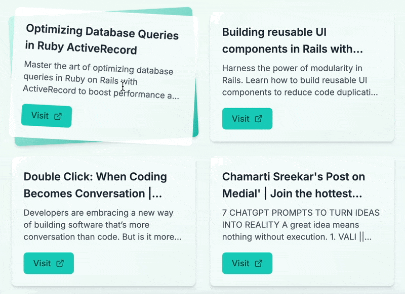
The tilted card (see code) is the one I like the most actually. It uses subtle 3D transforms to create a sense of depth. Getting this 3D tilt animation just right was one of the most satisfying part. I spent some time tweaking the rotation values and perspective settings until it felt natural:
<motion.div
  className="group h-full perspective-1000"
  initial={{ rotateX: 0, rotateY: 0, rotateZ: 0 }}
  whileHover={{ rotateX: 0, rotateY: 0, rotateZ: -3 }}
  transition={{ duration: 0.3 }}
>
I initially tried more dramatic rotations (around -8 degrees), but it made the text hard to read. The subtle -3 degree rotation ended up being just right - enough to create the effect without compromising usability.
Another interesting part was how the card has two distinct rotation effects working together. The entire card slightly tilts on hover (using the whileHover property), but then there's also a second rotation applied to the inner content using the group-hover:rotate-6 class:
// First rotation - entire card tilts slightly on hover
<motion.div
  className="group h-full perspective-1000"
  initial={{ rotateX: 0, rotateY: 0, rotateZ: 0 }}
  whileHover={{ rotateX: 0, rotateY: 0, rotateZ: -3 }}
  transition={{ duration: 0.3 }}
>
  {/* Second rotation - inner content rotates when parent is hovered */}
  <div className="relative transform-gpu transition-transform duration-300 ease-in-out group-hover:rotate-6">
    {/* Card content */}
  </div>
</motion.div>
Getting these two rotations to work together without fighting each other was tricky, but the result is what gives the card that satisfying 3D effect.
Also, if you notice, I added the transform-gpu class to force hardware acceleration for the animations. While testing, I found that technically removing it didn't have any obvious effect, but I kept it just as a best practice. It's one of those small details that might not be noticeable on high-end systems but could make a difference in edge cases.
Crafting a Thoughtful Color System
As if multiple card theme weren't enough, I created these different color presets to let people further customize their experience.
Rather than using random colors, I created a carefully curated set of color presets that work harmoniously in both light and dark modes:
export const colorPresets: ColorPreset[] = [
  {
    name: "Ocean Breeze",
    lightStart: "#a5f3fc",
    lightEnd: "#0ea5e9",
    darkStart: "#0369a1",
    darkEnd: "#0c4a6e",
  },
  {
    name: "Sunset Glow",
    lightStart: "#fecaca",
    lightEnd: "#f87171",
    darkStart: "#b91c1c",
    darkEnd: "#7f1d1d",
  },
  // Other color presets...
];
Each preset includes four colors:
lightStartandlightEnd: For creating gradients in light modedarkStartanddarkEnd: Adjusted variants for dark mode that maintain the color identity while ensuring proper contrast
I named each preset based on natural themes ("Ocean Breeze," "Sunset Glow," "Forest Mist") to make them intuitive and memorable.
To ensure colors always look good regardless of theme, I implemented helper functions for determining text colors based on background brightness:
function isLightColor(color: string): boolean {
  return Color(color).isLight();
}

function getContrastColor(color: string): string {
  return isLightColor(color)
    ? Color(color).darken(0.6).hex()
    : Color(color).lighten(0.6).hex();
}
This allowed for dynamic text color adjustment that maintains readability across all color combinations.
Analytics Implementation to make data-driven decisions
I'm capturing three main types of events:
- Card theme selection: When users change themes or when the page first loads
- Tab view duration: How long users spend in each content category
- Link clicks: Which links users actually click on, and from which card theme
To make data-driven design decisions, I implemented detailed PostHog analytics tracking throughout the application. Rather than just tracking page views, I captured specific user interactions:
// Track theme selection
posthog.capture("card_theme_selected", {
  theme: value,
  action: "changed",
});

// Track link clicks with theme context
const handleLinkClick = () => {
  posthog.capture("link_clicked_tilted_card", { url });
};

// Track tab view duration
useEffect(() => {
  const duration = (Date.now() - tabStartTime.current) / 1000;
  posthog.capture("tab_view_duration", { tab: activeTab, duration });
  tabStartTime.current = Date.now();
}, [activeTab]);
Notice how each card theme has its own specific tracking event (link_clicked_tilted_card, link_clicked_notebook_card, etc.) rather than a generic event. This granularity allows me to determine if certain card designs are more effective at encouraging clicks.
What the Data Revealed: The Default Bias
After collecting data for a while, I was surprised by the theme selection breakdown:
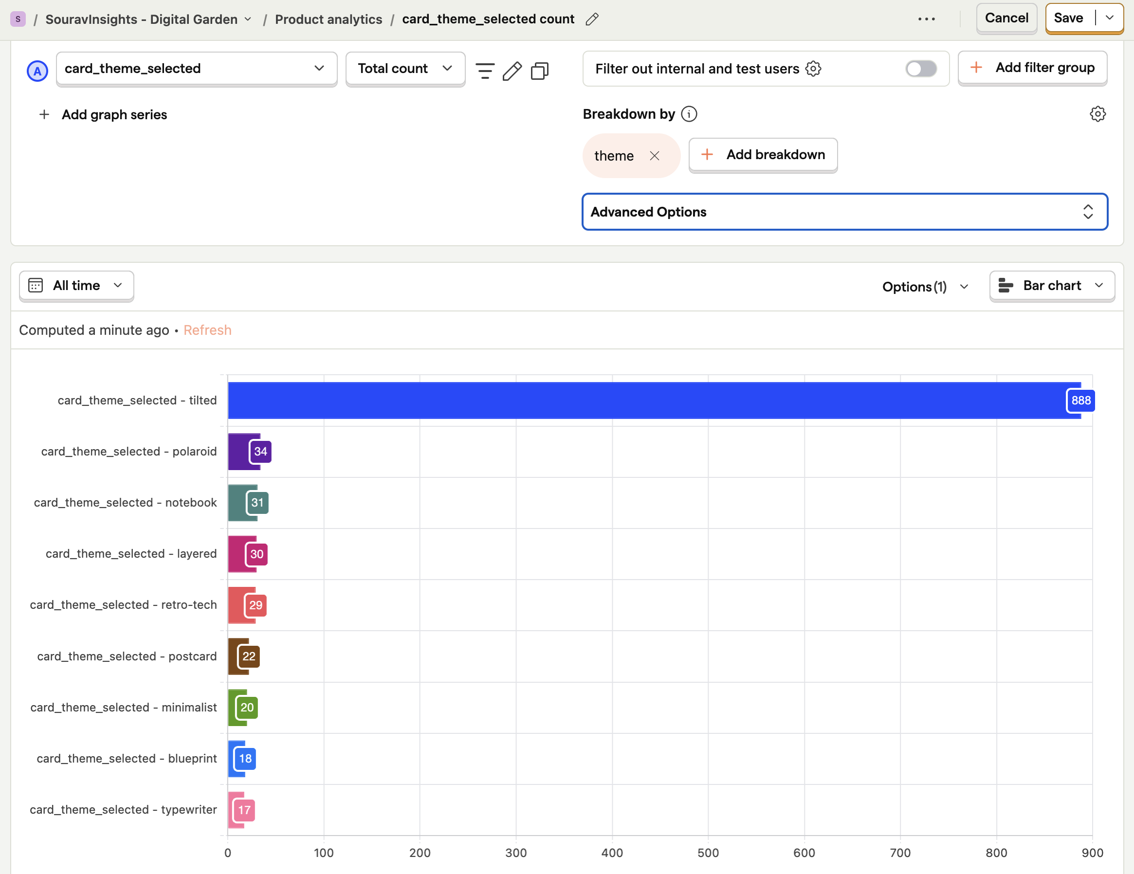
The tilted theme (my default) dominated with 888 selections, while other themes had between just 17-34 selections each:
- Tilted: 888 selections
- Polaroid: 34 selections
- Notebook: 31 selections
- Layered: 30 selections
- Retro-tech: 29 selections
- Postcard: 22 selections
- Minimalist: 20 selections
- Blueprint: 18 selections
- Typewriter: 17 selections
Now, the reason why Tilted Card was selected most is probably because it was the default selected choice? Maybe users didn't really click the tiny "Customize" button at all? Maybe it the theme selection configuration wasn't easily discoverable?
Refining the UI Based on Analytics Insights
I'm so glad that went an extra mile with adding Posthog tacking for all these events which revealed that my initial customization UI, while functional, wasn't inviting user interaction.
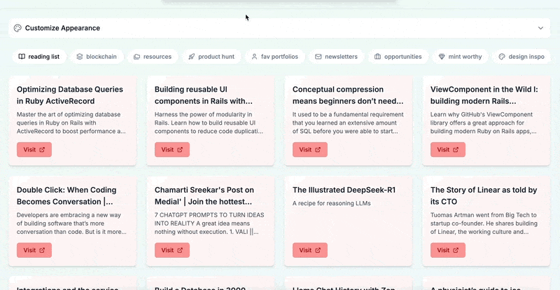
Here's how the theme selection UI originally looked like:
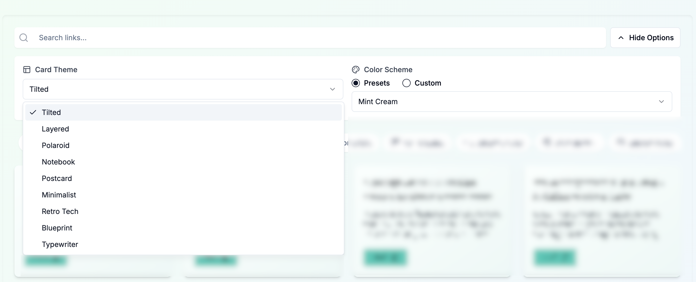
Problems with this layout
The discoverability of the customization options could be a major factor in why so few users are exploring different themes.
- Poor visibility: The "Customize" button was small and competing with the search bar (which bdw isn't really functional) for attention
- Unclear purpose: The label "Customize" doesn't clearly communicate what users can do
- Hidden options: All theme choices were buried in a dropdown menu inside a collapsible panel
- Complex UI hierarchy: The options panel contained both Select dropdowns and a RadioGroup, creating a multi-level interaction pattern
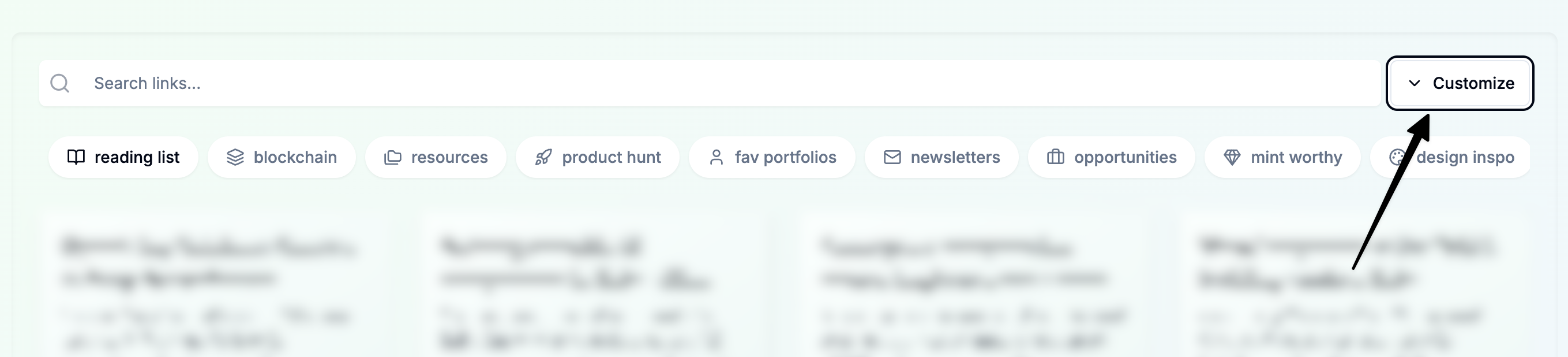
So I decided to completely redesign the UI to improve discoverability:
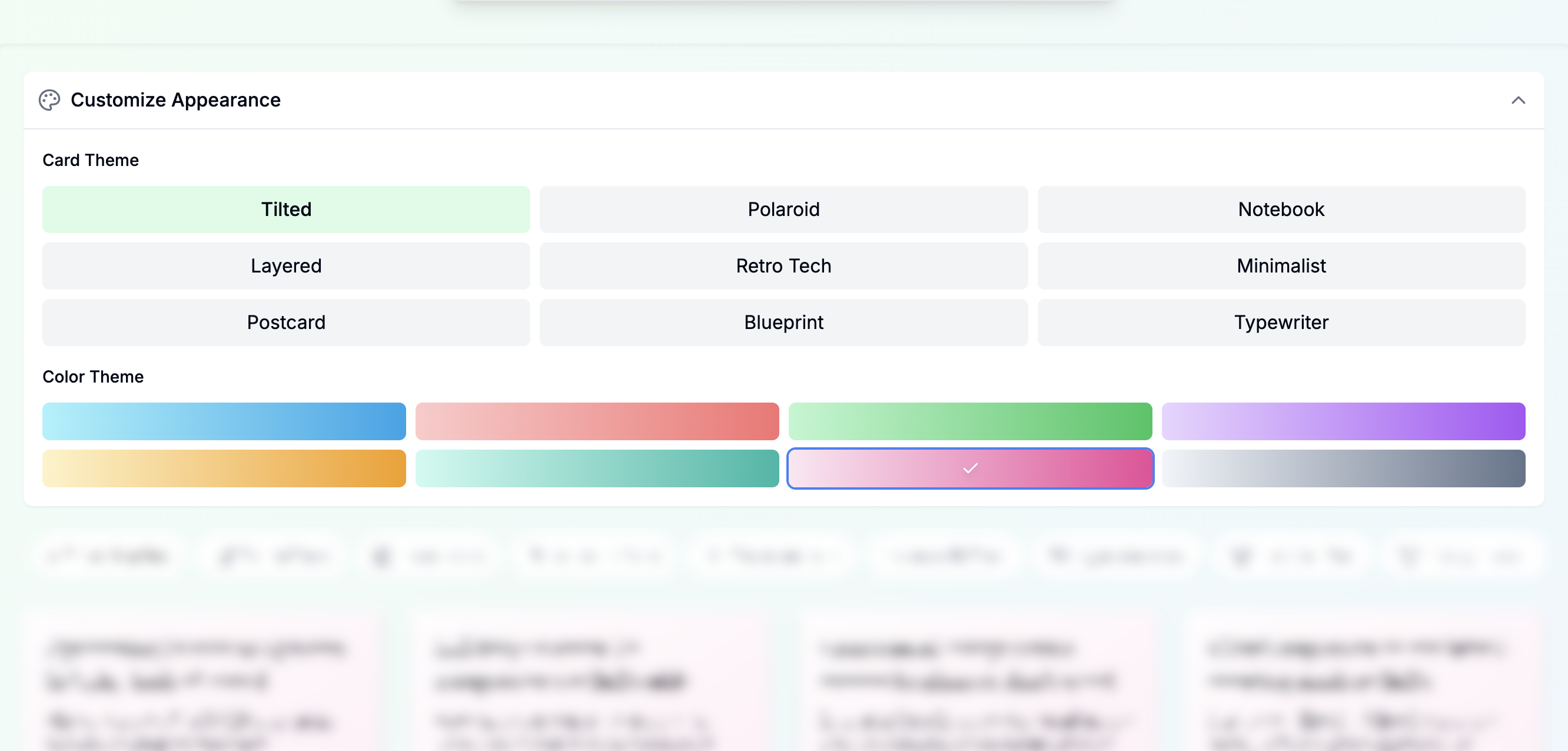
Key improvements in the redesign:
- Full-width toggle button that's much more prominent than the original small button
- Visual grid of theme options instead of a dropdown, showing all options at once
- Direct visual feedback with active selection highlighted in a distinct color
- Responsive grid layout that works well on both mobile and desktop
Key Lessons
Building this interactive Digital Garden and analyzing user behavior has taught me several valuable lessons:
- Analytics reveal unexpected patterns - Without PostHog data, I would never have realized how dominant the default theme selection was or how few users were discovering customization options.
- UI discoverability requires deliberate design - Features that seem obvious to me as the creator may be completely invisible to users.
- Visual interfaces reduce interaction cost - Replacing dropdowns with direct visual options significantly lowers the barrier to exploration. When users can see all options at once, they're much more likely to try them.
- Data should inform design, not dictate it - While analytics reveal problems and opportunities, the solution still requires thoughtful design thinking. The numbers tell you what's happening, not necessarily why or how to fix it.
I'm continuing to refine this experience based on user behavior data, with the goal of creating a Digital Garden that balances discoverability with aesthetic appeal and functional clarity.
The code for this project is available on GitHub if you'd like to see how it all works together or adapt these techniques for your own projects.